Tools
Concepts
Interpretation & Calculations
Histograms, Process Capability
Applications
Key Success Factors for the Implementation of SPC
How to Study Process Capability
SPC to Improve Quality, Reduce Cost
Use Of SPC To Detect Process Manipulation
Control chart interpretation
The following is an excerpt from The Quality Engineering Handbook by Thomas Pyzdek, © QA Publishing, LLC.
Control charts provide the operational definition of the term special cause. A special cause is simply anything which leads to an observation beyond a control limit. However, this simplistic use of control charts does not do justice to their power. Control charts are running records of the performance of the process and, as such, they contain a vast store of information on potential improvements. While some guidelines are presented here, control chart interpretation is an art that can only be developed by looking at many control charts and probing the patterns to identify the underlying system of causes at work.
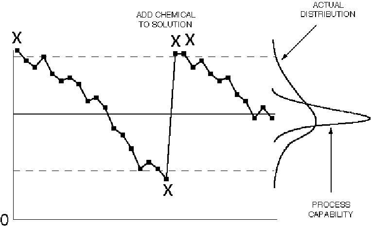
Figure IV.17. Control chart patterns: freaks.
Freak patterns are the classical special cause situation. Freaks result from causes that have a large effect but that occur infrequently. When investigating freak values look at the cause-and-effect diagram for items that meet these criteria. The key to identifying freak causes is timelines in collecting and recording the data. If you have difficulty, try sampling more frequently.

Figure IV.18. Control chart patterns: drift.
Drift is generally seen in processes where the current process value is partly determined by the previous process state. For example, if the process is a plating bath, the content of the tank cannot change instantaneously, instead it will change gradually. Another common example is tool wear: the size of the tool is related to its previous size. Once the cause of the drift has been determined, the appropriate action can be taken. Whenever economically feasible, the drift should be eliminated, e.g., install an automatic chemical dispenser for the plating bath, or make automatic compensating adjustments to correct for tool wear. Note that the total process variability increases when drift is allowed, which adds cost. When this is not possible, the control chart can be modified in one of two ways:
1. Make the slope of the center line and control limits match the natural process drift. The control chart will then detect departures from the
natural drift.
2. Plot deviations from the natural or expected drift.
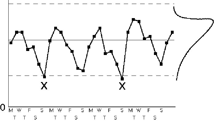
Figure IV.19. Control chart patterns: cycles.
Cycles often occur due to the nature of the process. Common cycles include hour of the day, day of the week, month of the year, quarter of the year, week of the accounting cycle, etc. Cycles are caused by modifying the process inputs or methods according to a regular schedule. The existence of this schedule and its effect on the process may or may not be known in advance. Once the cycle has been discovered, action can be taken. The action might be to adjust the control chart by plotting the control measure against a variable base. For example, if a day-of-the-week cycle exists for shipping errors because of the workload, you might plot shipping errors per 100 orders shipped instead of shipping errors per day. Alternatively, it may be worthwhile to change the system to smooth out the cycle. Most processes operate more efficiently when the inputs are relatively stable and when methods are changed as little as possible.
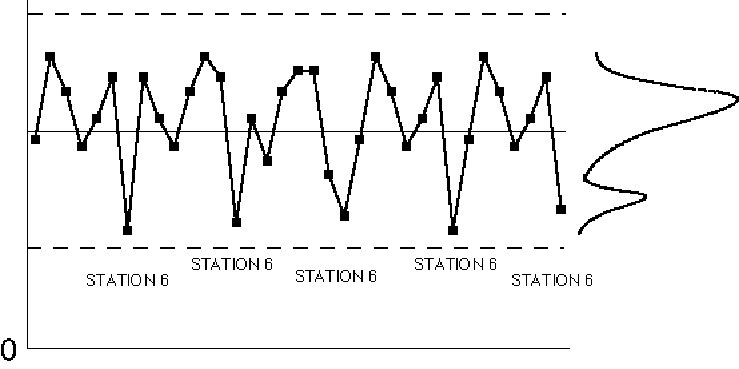
Figure IV.20. Control chart patterns: repeating patterns.
A controlled process will exhibit only "random looking" variation. A pattern where every nth item is different is, obviously, non-random. These patterns are sometimes quite subtle and difficult to identify. It is sometimes helpful to see if the average fraction defective is close to some multiple of a known number of process streams. For example, if the machine is a filler with 40 stations, look for problems that occur 1/40, 2/40, 3/40, etc., of the time.
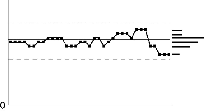
Figure IV.21. Control chart patterns: discrete data.
When plotting measurement data the assumption is that the numbers exist on a continuum, i.e., there will be many different values in the data set. In the real world, the data are never completely continuous. It usually does not matter much if there are, say, 10 or more different numbers. However, when there are only a few numbers that appear over-and-over it can cause problems with the analysis. A common problem is that the R chart will underestimate the average range, causing the control limits on both the average and range charts to be too close together. The result will be too many "false alarms" and a general loss of confidence in SPC.
The usual cause of this situation is inadequate gage resolution. The ideal solution is to obtain a gage with greater resolution. Sometimes the problem occurs because operators, inspectors, or computers are rounding the numbers. The solution here is to record additional digits.
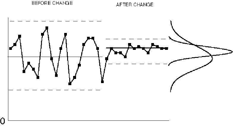
Figure IV.22. Control chart patterns: planned changes.
The reason SPC is done is to accelerate the learning process and to eventually produce an improvement. Control charts serve as historical records of the learning process and they can be used by others to improve other processes. When an improvement is realized the change should be written on the old control chart; its effect will show up as a less variable process. These charts are also useful in communicating the results to leaders, suppliers, customers, and others interested in quality improvement.
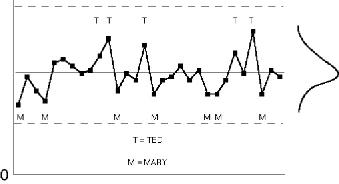
Figure IV.23. Control chart patterns: suspected differences.
Seemingly random patterns on a control chart are evidence of unknown causes of variation, which is not the same as uncaused variation. There should be an ongoing effort to reduce the variation from these so-called common causes. Doing so requires that the unknown causes of variation be identified. One way of doing this is a retrospective evaluation of control charts. This involves brainstorming and preparing cause and effect diagrams, then relating the control chart patterns to the causes listed on the diagram. For example, if "operator" is a suspected cause of variation, place a label on the control chart points produced by each operator. If the labels exhibit a pattern, there is evidence to suggest a problem. Conduct an investigation into the reasons and set up controlled experiments (prospective studies) to test any theories proposed. If the experiments indicate a true cause and effect relationship, make the appropriate process improvements. Keep in mind that a statistical association is not the same thing as a causal correlation. The observed association must be backed up with solid subject-matter expertise and experimental data.
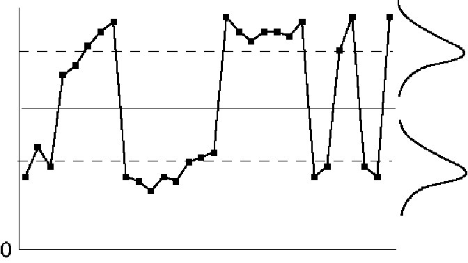
Figure IV.24. Control chart patterns: mixture.
Mixture exists when there data from two different cause-systems are plotted on a single control chart. It indicates a failure in creating rational subgroups. The underlying differences should be identified and corrective action taken. The nature of the corrective action will determine how the control chart should be modified.
Mixture example #1
The mixture represents two different operators who can be made more consistent. A single control chart can be used to monitor the new, consistent process.
Mixture example #2
The mixture is in the number of emergency room cases received on Saturday evening, versus the number received during a normal week. Separate control charts should be used to monitor patient-load during the two different time periods.
Rules for determining statistical control
Run tests
If the process is stable, then the distribution of subgroup averages will be approximately normal. With this in mind, we can also analyze the patterns on the control charts to see if they might be attributed to a special cause of variation. To do this, we divide a normal distribution into zones, with each zone one standard deviation wide. Figure IV.25 shows the approximate percentage we expect to find in each zone from a stable process.
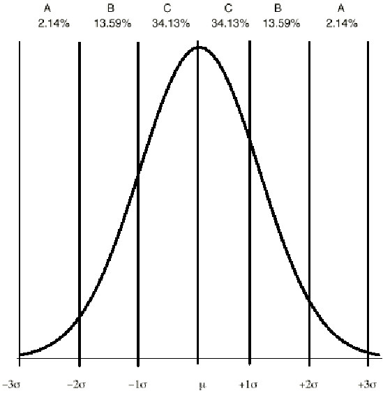
Figure IV.25. Percentiles for a normal distribution.
Zone C is the area from the mean to the mean plus or minus one sigma, zone B is from plus or minus one to plus or minus two sigma, and zone A is from plus or minus two to plus or minus three sigma. Of course, any point beyond three sigma (i.e., outside of the control limit) is an indication of an out-of-control process.
Since the control limits are at plus and minus three standard deviations, finding the one and two sigma lines on a control chart is as simple as dividing the distance between the grand average and either control limit into thirds, which can be done using a ruler. This divides each half of the control chart into three zones. The three zones are labeled A, B, and C as shown on Figure IV.26.
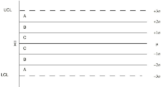
Figure IV.26. Zones on a control chart.
Based on the expected percentages in each zone, sensitive run tests can be developed for analyzing the patterns of variation in the various zones. Remember, the existence of a non-random pattern means that a special cause of variation was (or is) probably present. The averages, np and c control chart run tests are shown in Figure IV.27.
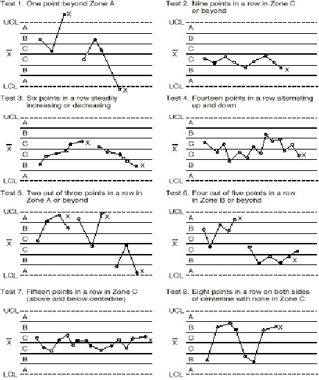
Figure IV.27. Tests for out of control patterns on control charts.
From "The Shewhart Control Chart–Tests for Special Causes," Journal of Quality Technology, 16(4), p 238. Copyright © 1986 by Nelson.
Note that, when a point responds to an out-of-control test it is marked with an "X" to make the interpretation of the chart easier. Using this convention, the patterns on the control charts can be used as an aid in troubleshooting.
Learn more about the SPC principles and tools for process improvement in Statistical Process Control Demystified (2011, McGraw-Hill) by Paul Keller, in his online SPC Concepts short course (only $39), or his online SPC certification course ($350) or online Green Belt certification course ($499).


