Quality America Inc.

Contact Info

Email Sales

Log In

Site Search

Menu

Show navigation Hide navigation
  • SPC Software
    • SPC-PC IV Explorer
    • QA-Calibrate
    • SPC IV Excel
    • Green Belt XL
    • My Software
  • Training & Certification
    • Certification Courses
    • Short Courses & Study Guides
    • Instructor Materials
    • Process Excellence Books
    • Knowledge Center
    • My Courses
  • Company
    • About Us
    • Catalog
    • Satisfaction Guarantee
    • Development Process
    • Privacy Policy
    • Contact Us

You are here:

  1. Home
  2. SPC Software
  3. SPC IV Excel
  4. Slideshow
  5. Filtering your SPC Excel Analysis

Product Nav

  • Tutorial
  • Step One - Select a Chart
  • Step Two - Organize Your Data
  • Step Three - Options
  • Step Four - Placement
  • Your Finished SPC Chart
  • Displaying Statistics and Other Format Options
  • Filtering your SPC Excel Analysis
  • Removing Subgroups from the SPC Analysis
  • Quickly Display Process Shifts
  • Basing Control Limit on Fixed Values or Subsets of Data
  • Adding Notes to Your SPC Chart
  • Distributing Your SPC Analysis
  • Try SPC IV Excel Yourself

Filtering your SPC Excel Analysis

By default, all the data within the data range specified in Step 2 is shown on the chart. You can optionally filter the chart to only show data meeting a specified condition in Step 2.

From the open chart, choose the Data Range option from the right mouse menu. In the Subgroup Plotting section, click (place a check mark in the box preceding) the Plot Last x Groups option, then enter (or use the up/down arrows) to specify 30 groups, as shown in the dialog box below.

Displaying only the most recent subgroups on your SPC chart in Excel

Click the Finish button to show the updated chart, which now shows only the last 30 subgroups as specified. From the open chart, choose the Data Range option from the right mouse menu, then the Filter button.

  1. Click the Apply Data Filter option;

  2. Select the column $G:$G from the Criteria Field list;

  3. Select the "Does Not Equal" option from the Operator list;

  4. Enter the text "S2112" (without the quotes) into the Criteria Value text box.

Filtering your SPC chart in Excel based on traceability columns

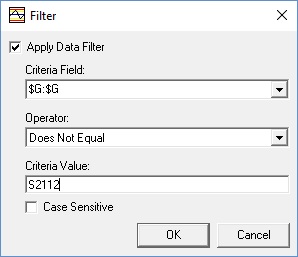
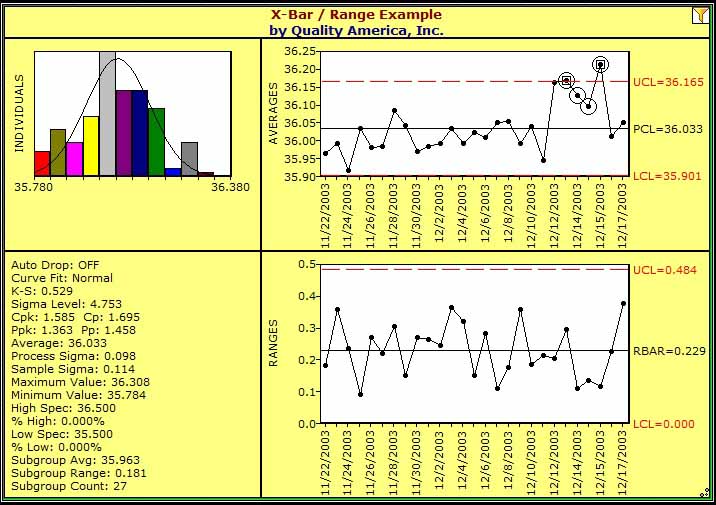
Your choices should look as shown here. Click the OK button to close the Filter dialog, then the Finish button to show the updated chart (shown below). Note that the software has applied all the specified conditions to determine the chart's plotted data: The last 30 subgroups in columns B through F where column G does not equal S2112. In this case, the filter removed the first three subgroups seen in the last chart because their corresponding value in column G did not meet the "does not equal S2112" condition, resulting in only 27 groups included in the analysis.

The effects of filtering your SPC chart in Excel
« Previous
Up
Next »

Since 1982: The art & science to improve your bottom line

Quality America offers Statistical Process Control software, as well as training materials for Lean Six Sigma, Quality Management and SPC. We embrace a customer-driven approach, and lead in many software innovations, continually seeking ways to provide our customers with the best and most affordable solutions. Leaders in their field, Quality America has provided software and training products and services to tens of thousands of companies worldwide.

More//

Menu

  • SPC Software
    • SPC-PC IV Explorer
    • QA-Calibrate
    • SPC IV Excel
    • Green Belt XL
  • Training & Certification
    • Certification Courses
    • Instructor Materials
    • Short Courses & Study Guides
    • Process Excellence Books
    • Knowledge Center
    • My courses
  • Company
    • About Us
    • Satisfaction Guarantee
    • Development Process
    • Privacy Policy
    • Terms & Conditions
    • Contacts


sales@qualityamerica.com
Linked-In page

Copyright © 2025 Quality America Inc.
Quality America Inc.