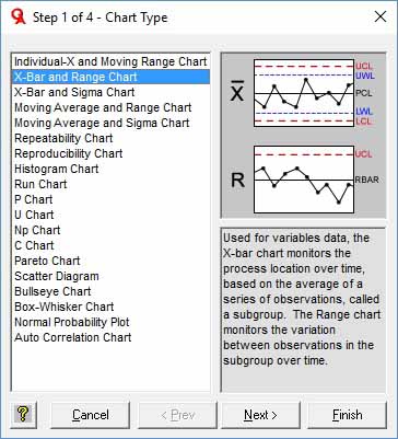
Step One - Select a Chart
In the SPC IV Excel menu, select the New Chart button. You will see the dialog box below, containing a list of many charts available to choose from:
- Control Charts for individuals (n=1) data, such as Individual-X and Moving Range charts, Moving Average and Range charts and Moving Average and Sigma charts;
- Control Charts for subgrouped data (n>1), such as X-Bar and Range charts, X-Bar and Sigma charts,Moving Average and Range charts and Moving Average and Sigma charts;
- Repeatability Chart and Reproducibility Chart for measurement systems analysis;
- Histogram Chart for showing a process distribution (Histograms are also shown with the Individual-X and X-Bar charts, which is the preferred way to show Histograms so you can see the process is in control);
- Attribute Control Charts, including P Charts, U Charts, Np Charts, and C Charts;
- Pareto Charts for prioritization of improvement opportunities;
- Scatter Diagrams with ANOVA and Regression Analysis to analyze correlation;
- Bullseye Charts to analyze two parameters with respect to their desired or expected range;
- Box Whisker Charts to compare location and variation of key process parameters;
- Normal Probability Plots to determine if a set of data fits a normal distribution.
To the right of each chart selection, you'll see a sample graphic with explanation to guide your selection. Elsewhere in the Help System, you'll find detailed guidance on when to use, how to interpret, and the underlying calculations for each chart. In the Green Belt XL version of the software, the menu bar also provides a Sigma Level calculator, Matrix Diagrams and the Prioritization Matrix.
Once you've selected the desired chart from the list, use the Next button to advance to Step Two.