Tools
Intervals & Tests
Hypothesis Test Of Sample Mean Example
Hypothesis Test Of Two Sample Variances Example
Hypothesis Test Of A Standard Deviation Compared To A Standard Value Example
Distributions
Area Under the Standard Normal Curve
Non-Normal Distributions in the Real World
Rayleigh Distribution for True Position
Non-Normal Distributions in the Real World
by Thomas Pyzdek
Introduction
One day, early in my career in quality, I was approached by Wayne, a friend and the manager of the galvanizing plant. "Tom" he began, "I've really been pushing quality in my area lately and everyone is involved. One of the areas we are working on is the problem of plating thickness. Your reports always show 3% - 7% rejects and we want to drive that number down to zero."
I was, of course, pleased. The galvanizing area had been a perennial problem child of the company. "How can I help?" I asked.
"We have been having meetings, trying to discover the cause of the low thicknesses. But we are stumped. I want to take copies of the quality reports to the team so they can see what was happening with the process when the low thicknesses were produced."
"No problem," I said, "I will have them for you this afternoon."
Wayne left and I went to my file of galvanizing reports. The inspection procedure called for seven light poles to be sampled each hour and plotted. I took the reports and computed the daily average and standard deviation by hand (this was in the BPC era, "Before Personal Computers"). Then, using a table of normal distribution areas, I found the estimated percent below the low specification limit. This number was reported to Wayne and to a number of other important people. As Wayne said, the number tended to be between 3% and 7%.
But, after searching through hundreds of galvanizing reports, I found not a single thickness below the minimum. My faith in the normal distribution was not shaken, however. I concluded that the operators were "adjusting" their results by failing to record out-of-tolerance thicknesses. I set out for the storage yard with my thickness gauge in hand to prove my theory.
Hundreds of parts later, I was forced to admit defeat. There simply were not any thickness readings below the minimum requirement. News of this was met with shock and dismay by the hard-working galvanizing teams. Wayne commented:"How could you people do this to us?"
This embarrassing experience led me to begin a personal exploration of just how common normal distributions really are. After nearly two decades of research involving thousands of real- world manufacturing and non-manufacturing operations, I have an announcement to make: Normal Distributions are Not the Norm!
I say this knowing full well that you have heard otherwise from one or more "experts." Well, you heard wrong. You can easily prove this to yourself by collecting data from real live processes and evaluating it with an open mind. In fact, the early pioneers of quality (such as Shewhart) were fully aware of the scarcity of normally distributed data; since then, somehow, we have forgotten. Today the prevailing wisdom seems to be "if it is not normal, something must be wrong." Well, that is just not so.
The Normal Distribution
Figure 1: Sum of 10 Dice Rolled 1,000 Times
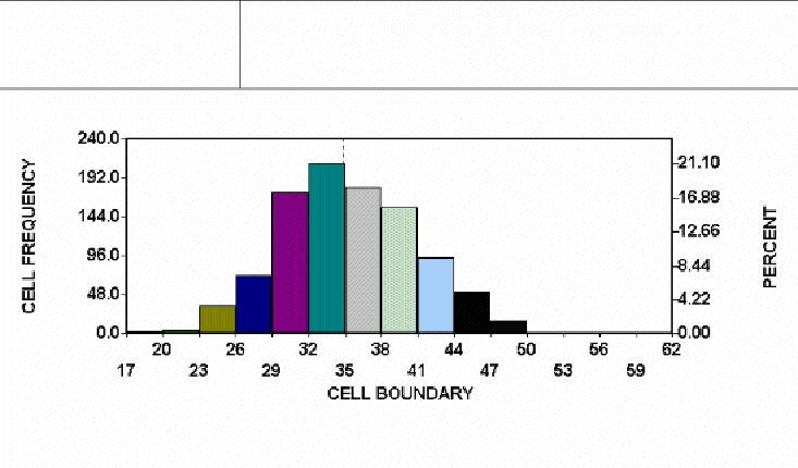
Consider figure one, which is a histogram graph of the sum of the spots showing when ten six-sided dice were thrown one thousand times (and you thought the life of a quality consultant was exciting). The shape of the histogram is approximately normal. This means:
- A curve that is computed from the normal distribution function passes near the midpoints of the histogram cells.
- Both halves of the histogram look about the same.
- There is a single mode, or peak.
- Either the histogram is unbounded on both ends, or the bounds are so far away as to not matter.
Think for a moment about the "process" used to create this near-normal histogram, its features are:
- There are a large number of variables (ten dice).
- The variables are completely independent of one another (die number 5 does not change if some other die changes).
- The value of any given variable (die) is determined by random chance.
- The value of a given variable (die) on a given roll is completely independent of any previous rolls.
Processes which possess similar features will produce distributions that are approximately normal. Nature may well produce many such processes if left alone, I am not conversant enough about such processes to know. However, I do know that business processes do not produce normal distributions. There are many reasons why this is so. One big reason is that the objective of most management and engineering activity is to control natural processes tightly, eliminating sources of variation whenever possible. The result of this control is often value added to the customer; for example, who would want to stay in an outdoor hotel? Other distortions occur when we try to measure our results. Here are some examples of "de-normalizing" activities:
Human Behavior Patterns
Figure 2: Days receive payment from time invoice is sent
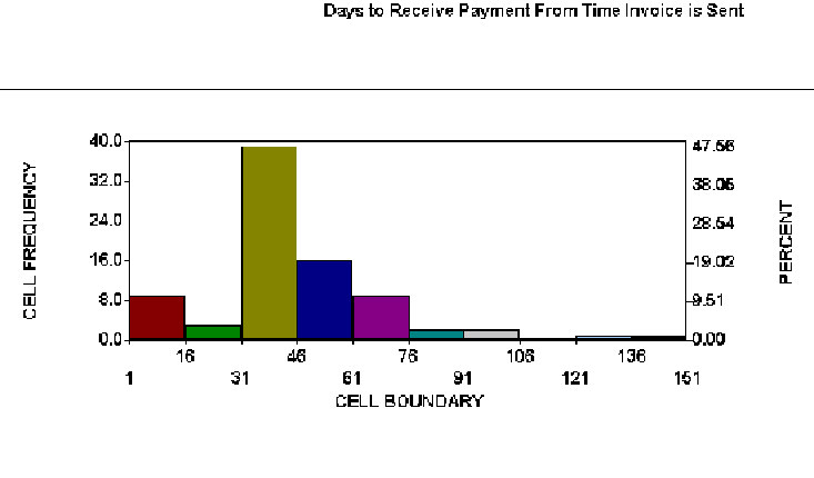
Figure 2 shows a histogram of real data from a billing process. A control chart of days-to-pay for non-prepaid invoices showed statistical control. The histogram indicates that some customers like to prepay, thus eliminating the work associated with tracking accounts payable. Customers that do not prepay tend to send payments to arrive just after the due date. There is a second, smaller spike after statements are sent, then a gradual drop off. The high end is literally unbounded because a few customers will never pay their bill. This pattern suggests a number of possible process improvements, but the process will probably never produce a normally distributed result. Human behavior is rarely random and processes involving human behavior are rarely normal.
Management Systems
The measurement system may create a normal distribution where none exists! I have seen measurement systems with such crude repeatability that virtually all of the variability in the numbers was from measurement error. As Gauss observed nearly two hundred years ago, measurement error seems to tend toward normality (Kotz & Johnson, 1985). At least the measurement errors studied by Gauss.
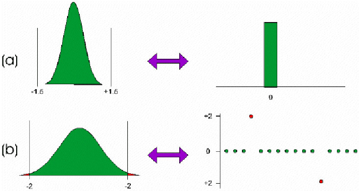
More often measurement systems produce distortions which make the data appear less normal. Figure 3a shows a process distribution that is normal. Figure 3b shows a histogram obtained when using a gauge with a resolution of two measurement units. It might be tempting to simply use a "better" gauge. But what if the cost goes up by a factor of 100 (I have seen this much and more). Or what if the tolerance is + 50 measurement units? Sometimes it is simply not worth the effort just to get the results some expert says you are "supposed" to get.
Figure 3. (a) Actual process distribution; (b) measurement distribution (gage resolution = 2 units)
At times the measurement is non-normal because of the scale of measurement. For example, pH or decibel scales. These data can sometimes be made normal by using the logarithm of the result. But why confuse everyone just to get a normally distributed result?
Physical Laws
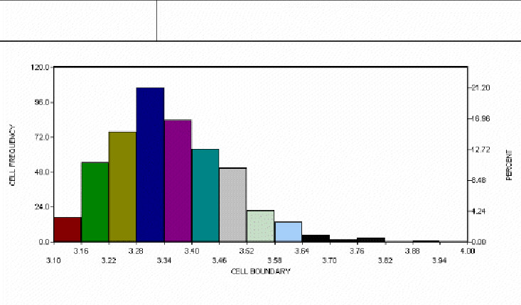
Nature does not always follow the "normal law" either. Often natural phenomena produce distinctly non-normal patterns. The hot-dip galvanizing process discussed earlier is an example. A metallurgist described the process to me (alas, too late to prevent the aforementioned debacle) as the creation of a zinc-iron alloy at the boundary. The alloy forms when the base material reaches the temperature of the molten zinc. Pure zinc will accumulate after the alloy layer has formed. However, if the part is removed before the threshold temperature is reached, no zinc will adhere to the base metal. Such parts are so obviously defective that they are never made. Thus, the distribution is bounded on the low side by the alloy layer thickness, but (for all practical purposes) unbounded on the high side since pure zinc will accumulate on top of the alloy layer as long as the part remains submerged. Figure 4 shows the curve for the process --- a non-normal curve.
Figure 4: Distribution of Zinc Plating Thickness
Many other natural processes are non-normal. The breaking strength of a metal is a smallest extreme value distribution (the break occurs at the weakest point). A gap is bounded at zero. A hole cannot be smaller than the punch that made it. The list goes on and on.
Engineering Activity
When nature does not impose constraints, people often do so. Such things as locating pins, positive stops or automatic sensors often bound or truncate the distribution. Blanking dies or pin/punches can doubly bound a distribution.
Numerically controlled (NC) machines often have backlash in their positioning mechanisms that create one distribution when moving away from the home position, and a completely different distribution when moving toward home, resulting in a bimodal distribution with a "dead zone" in the middle.
Chemical and electrical engineers have their own bag of tricks for bounding, truncating, or otherwise manipulating nature. It is what engineers do. It is where products and processes come from. The fact that the result is not normal does not matter.
Inspection
Sometimes inspection itself can create non-normal data. ANSI Y14.5, a standard for dimensioning and tolerancing used by all aerospace and defense contractors, describes a concept called "true position." The true position of a feature is found by converting an X and Y deviation from target to a radial deviation and multiplying by two. Even if X and Y are normally distributed (of course, they usually are not), the true position will not be. True position is bounded at zero and the shape often depends solely on the standard deviation.
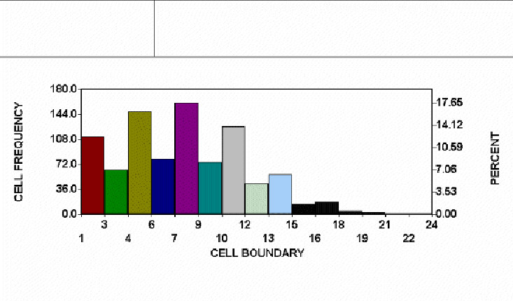
Many other inspection procedures create non-normal distributions from erstwhile normal data. Perpendicularity might be normally distributed if the actual angle was measured and recorded. But quite often perpendicularity is measured as the deviation from 90 degrees, with 88 degrees and 90 degrees both being shown as 2 degrees from 90 degrees. The shape of the resulting distribution varies depending on the mean and standard deviation. Its shape can be anything from a normal curve to a decidedly non-normal curve. An example is shown in figure 5 (note the "comb tooth" pattern indicating rounding off of the numbers, yet another cause of non-normality). This discussion also applies to flatness, camber, and most other form callouts in ANSI Y14.5. The shape of the curve tells you nothing about your control of the process.
Figure 5: Perpendicularity in Thousandths of Inches
Implications
A purist might say at this point "So What?" After all, any model is merely an abstraction of reality and in error to some extent. True enough, but when the error is so large that it has drastic consequences, the model should be re-evaluated and perhaps discarded. Such is often the case with the normal model.
Process capability analysis (PCA) is a procedure used to predict the long-term performance of statistically controlled processes. Virtually all PCA techniques assume the process distribution is normal. If it is not, PCA methods, such as Cpk, may say an incapable process is capable, or vice versa. It may predict high reject rates, when in reality no rejects ever appear, as with the galvanizing process discussed earlier, or vice versa.
If you are among the enlightened few who have abandoned the use of "goal post tolerances" and PCA, you will find that assuming normality hampers your efforts at continuous improvement. If the process distribution is skewed, the optimal setting (target) will be somewhere other than the center of the engineering tolerance; but you will never find it if you assume normality. Your quality improvement plan must begin with a clear understanding of the process and its distribution.
Failure to understand non-normality leads to tampering, increased reject rates, sub-optimal process settings, failure to detect special causes, missed opportunities for improvement, and many other problems. The result is loss of face, loss of faith in SPC generally, and strained customer - supplier relations.
Solutions
The most important solution: THINK! Do not use statistics-by-rote, blindly plugging numbers into formulas and accepting the results. Plot a histogram of the data after you have attained statistical control and think about how the histogram pattern relates to the real world.
If you decide that the non-normal process distribution really should be non-normal, use your new knowledge to help you manage and improve the process. Adjust your target values and control limits to minimize rejects and to improve product performance.
Software can help you perform PCA with non-normal data. Such software will base yield predictions and capability index calculations on either models or the best fit curve, instead of assuming normality. One software package can even adjust the control limits and the center line of the control chart so that control charts for non-normal data are statistically equivalent to Shewhart control charts for normal data (Pyzdek, 1991). With modern software, proper analysis of on-normal data is as easy as assuming normality.
Another View
Not all authors agree that it is necessary or wise to modify process capability analysis (PCA) or control limits to compensate non-normality. The major objections to the practice are (Wheeler, 1995, 46-54):
1. Non-normal adjustment are based on the third and fourth moments of the distribution, which contain little information compared with the mean and variance.
2. Estimates of the higher moments are unstable and therefore unreliable unless sample sizes are unreasonably huge.
3. Subgroups with similar skewness and kurtosis statistics may have dramatically different distributions.
4. Higher moments confuse users.
Consider these objections one by one.
Non-normal adjustment are based on the third and fourth moments of the distribution, which contain little information compared with the mean and variance
True, but a little information is still information. Most of the added information describes the tails of the distributions, which is the primary area of interest for quality analysis. This is especially true when conducting PCA studies, but it also applies to control charts. The added information is virtually cost free when using computers. If you get something for nothing, why not take it?
Estimates of the higher moments are unstable and therefore unreliable unless sample sizes are unreasonably huge
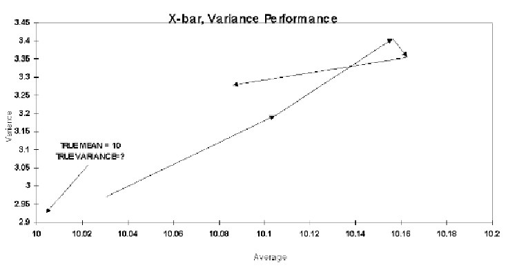
To support this contention, one author provides a graph showing that the skewness and kurtosis statistics converge only slowly towards their theoretical value (this is much more so for Kurtosis than skewness). However, the same approach can be used to show that the mean and variance are "useless." Figure 6 plots these two statistics for the data and sample sizes of 100, 200, 300, 400, and 500. Note that the mean estimate moves away from the true value for quite some time, and it is always on the high side. The author provides no parameter value for the variance, and one would be hard pressed to find it using figure 6. Does this imply that the sample average and variance have no value and should not be used? Of course not. The problem is with the method used to display the estimates rather than with the estimates themselves.
Figure 6: Convergence of Location and Spread Statistics to Theoretical Parameters
The author presents abstruse mathematics showing how the various moments are derived, but the math merely confuses the issue of the value of these moments for quality analysis. The method of derivation is irrelevant. The truth is that the higher moment estimates are reasonably stable for samples of sizes usually recommended for PCA (n >= 125), especially skewness. Because of modern data processing and storage technologies, many processes have thousands of historical data points on file. For decidedly non-normal data, PCA estimates using the skewness and kurtosis estimates from even as few as n=100 samples usually provides better results than PCA that assumes normality. Bear in mind that the Western Electric Statistical Quality Control Handbook recognized the need for dealing with skewed data at least as early as 1956, and they also provided a crude formula for the purpose of curve fitting.
Subgroups with similar skewness and kurtosis statistics often have dramatically different distributions
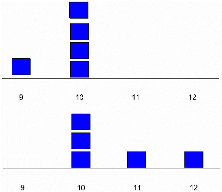
The author presents a graph showing a scatterplot of skewness and kurtosis for 100 subgroups and notes that few of the subgroups are close to the theoretical value. He also presents "histograms" of several subgroups with similar skewness and kurtosis statistics, showing that the "distributions" are different. Once again, if this approach were applied to the mean and variance it would also lead to the conclusion that these statistics are without value (figure 7). But this ignores the fact that no one is suggesting that we create control charts of the higher moments. They are only to be computed from aggregate data from a large number of subgroups. Plotting scatter plots and histograms of skewness or kurtosis for subgroups of n=5 is just plain silly, for that matter plotting histograms and scatter plots of any statistics for samples of 5 is silly. I know of no qualified person who would recommend doing such a thing.
Figure 7: Two Subgroups with the Same Mean and Variance
Higher Moments Confuse Users
This has not been my experience. In fact, I explain the control limits for classic Shewhart charts and non-normal control charts in precisely the same way: they are limits on common cause variation. True, the calculations are (sometimes) more involved for non-normal data, but the calculations are handled by the computer and are therefore transparent to the user. I have found that users are far more confused if I insist on using classical control charts even if they produce, for example, negative numbers for length measurements and waiting times, defective rates greater than 100% or less than 0%, special cause indications where no special cause can be found, etc. Also, when classical control charts produce control limits beyond the bounds of a measurement or process, there is no way the control chart can indicate process improvement. As the story I opened this paper with indicates, users are more often angry when they learn that they have been wasting their time because someone used the wrong statistical technique to analyze their quality data, causing them to waste their time.
See also:
Process Capability for Non-Normal Data Cp, Cpk
References
Kotz, S. and Johnson, N.L., editors-in-chief, (1985), Encyclopedia of Statistical Sciences, Vol. 6, Wiley Interscience, New York, pp. 347-359.
Pyzdek, T., "Johnson Control Charts," Quality, February 1991.
Pyzdek, T., "Process capability analysis using personal computers," Quality Engineering, 4(3), 1992, pp. 419-440.
Wheeler, D.J. (1995), Advanced Topics in Statistical Process Control: The Power of Shewhart Charts. Knoxville, TN: SPC Press.
Charts courtesy Quality America SPC software
Learn more about the Statistical Inference tools for understanding statistics in Six Sigma Demystified (2011, McGraw-Hill) by Paul Keller, in his online Intro. to Statistics short course (only $89) or his online Black Belt certification training course ($875).


