Tools
7MP Management and Planning Tools
8QC Traditional Quality Control Tools
Failure Mode, Effects, and Criticality Analysis
Maintainability and Availability
Process Decision Program Charts
Pareto Charts

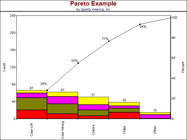
A Pareto Chart is a vertical bar graph showing problems in a prioritized order, so it can been determined which problems should be tackled first.
Choose the categories (or "problem areas") to collect data for by brainstorming, or use existing data to look for these problem areas. The data you analyze must be "counts" (Attributes data) or costs, and must be additive. Data should as yields or percentages cannot be added, so are inappropriate for Pareto analysis. You should also decide the time period over which the data should be collected.
Although the height of each bar provides the primary focus of the Pareto analysis (i.e. the highest (left-most) bar indicates the highest priority), it is sometimes useful to understand the impact of sub-categories within each bar, such as shown in the figure above.
Learn more about Pareto chart here:
Create and analyze a Pareto Chart in Excel
Learn more about the Quality Improvement principles and tools for process excellence in Six Sigma Demystified (2011, McGraw-Hill) by Paul Keller, or his online Green Belt certification course ($499).


