Tools
7MP Management and Planning Tools
8QC Traditional Quality Control Tools
Failure Mode, Effects, and Criticality Analysis
Maintainability and Availability
Process Decision Program Charts
Histogram

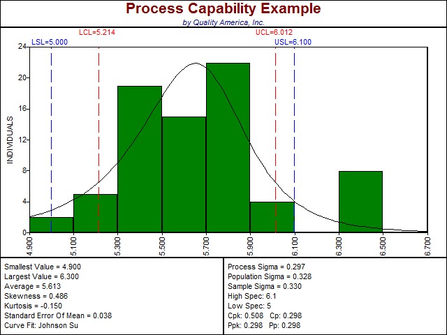
A histogram is a graphical tool used to visualize data that can be produced with histogram software such as Quality America's SPC programs. A histogram graph is a bar chart, where the height of each bar represents the number of observations falling within a range of rank-ordered data values.
METHODOLOGY
To make a histogram graph, rank order the data from the smallest value to the largest value.
Calculate the number of bars (or cells) as approximately equal to the square root of the number of data values. The number of cells (or bars) will influence the shape of the perceived distribution, so never base it on convenience, the data resolution, or anything other than the number of data observations.
The width of each bar is calculated by dividing the range of the data (the maximum value minus the minimum value) by the number of bars.
Count the number of data observations in each bar.
The vertical axis plots the count of observations in each bar. The horizontal axis displays the data values for each bar (usually either the starting point, ending point, or midpoint).
Easy to use Histogram software is available here.
See also:
Create and analyze a Histogram in Excel
Learn more about the Quality Improvement principles and tools for process excellence in Six Sigma Demystified (2011, McGraw-Hill) by Paul Keller, or his online Green Belt certification course ($499).


