Tools
7MP Management and Planning Tools
8QC Traditional Quality Control Tools
Failure Mode, Effects, and Criticality Analysis
Maintainability and Availability
Process Decision Program Charts
Interpreting Histograms
The main focus of the Histogram interpretation is the resulting shape of a distribution curve superimposed on the bars to cross most of the bars at their maximum height. If your data is from a symmetrical distribution, such as the Normal Distribution, the data will be evenly distributed about the center of the data. If the data is not roughly evenly distributed about the center of the histogram, it is commonly called "skewed". If it appears skewed, you should understand the cause of the "skewness". Some processes will naturally have a skewed distribution, and may also be bounded. If the variable is waiting time, the lower bound may be physically limited to zero.< /font>
If double or multiple peaks occur, look for the possibility that the data is coming from two different sources, such as two separate personnel groups, or two differently adjusted machines.
Remember that if the process is out of control, then by definition a single distribution cannot be fit to the data. Therefore, always use a control chart to determine statistical control before attempting to fit a distribution (or interpret the histogram).
INTERPRETATION
An excerpt from Six Sigma DeMYSTiFieD (2011 McGraw-Hill) by Paul Keller

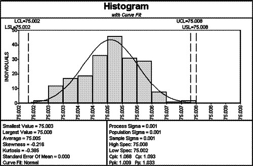
Figure F.16 Example of a histogram
An advantage of the histogram is that the process location is clearly identifiable. In Figure F.16, the central tendency of the data is about 75.005. The variation is also clearly distinguishable: we expect most of the data to fall between 75.003 and 75.007. We can also see if the data is bounded or if it has symmetry, such as is evidenced in this data.
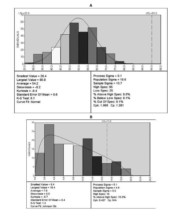
If your data is from a symmetrical distribution, such as the bell-shaped normal distribution as shown in Figure F.17A, the data will be evenly distributed about the center of the data. If the data is not evenly distributed about the center of the histogram, it is skewed. If it appears skewed, you should understand the cause of this behavior. Some processes will naturally have a skewed distribution, and may also be bounded, such as the concentricity data in Figure F.17B. Concentricity has a natural lower bound at zero, since no measurements can be negative. The majority of the data is just above zero, so there is a sharp demarcation at the zero point representing a bound.
If double or multiple peaks occur, look for the possibility that the data is coming from multiple sources, such as different suppliers or machine adjustments. Determining this can make understanding histograms easier.
The histogram provides a view of the process as measured. The actual output over a larger sample period may be much wider, even when the process is in control. As a general rule, 200 to 300 data observations are preferred to provide a realistic view of a process distribution, although it is not uncommon to use a histogram when you have much less data. Bear in mind that less data generally implies a greater risk of error for interpreting histograms.
One problem that novice practitioners tend to overlook is that the histogram provides only part of the picture. A histogram with a given shape may be produced by many different processes, the only difference in the data being their order. So the histogram that looks like it fits our needs could have come from data showing random variation about the average or from data that is clearly trending toward an undesirable condition. Since the histogram does not consider the sequence of the points, we lack this information. Statistical process control provides this context for understanding histograms.

Figure F.17 Two Histograms: (A) Histogram of symmetric process with normal distribution fit;(B) Histogram of skewed process with non-normal distribution fit.

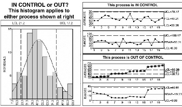
Figure F.18 This histogram conceals the time order of the process.
The two sets of control charts on the right side of Figure F.18 are based on the same data as shown in the histogram on the left. The only difference between the data in the top set of control charts versus the bottom set of control charts is the order of the data. It is clear that the top set of control charts is from a stable process, while the bottom set of control charts is from an out-of-control process. The histogram by itself fails to distinguish between these two very different processes, and it is therefore misleading in its ability to graphically depict the process distribution. In fact, there is no single distribution for the process represented by the bottom set of control charts, since the process is out of control. By definition, then, the data is from multiple process distributions.
Thus, if the process is out of control, then by definition a single distribution cannot be fit to the data. Therefore, always use a control chart to determine statistical control before attempting to fit a distribution (or determine capability) for the data.
Learn more about Histogram analysis here:
Minimum Number of Subgroups for Capability Analysis
Supplier Cpk data for straightness measurement
Process Capability for Non-Normal Data Cp, Cpk
Sample sigma vs. process sigma
Learn more about the Quality Improvement principles and tools for process excellence in Six Sigma Demystified (2011, McGraw-Hill) by Paul Keller, or his online Green Belt certification course ($499).


