Tools
Concepts
Interpretation & Calculations
Histograms, Process Capability
Applications
Key Success Factors for the Implementation of SPC
How to Study Process Capability
SPC to Improve Quality, Reduce Cost
Use Of SPC To Detect Process Manipulation
Multiple Steam Processes
by George Runger, Ph.D.
A multiple stream process (MSP) consists of several identical process streams. At a sample time, measurements are obtained from each stream (or a subset of the streams). The measurements are in the same units and often they have the same target value and variance.
MSPs are quite common:
· thickness measurements across a web or sheet (as seen in paper production, galvanizing steel, and magnetic tape manufacturing);
· diameter measurements at different radii or heights;
· measurements of identical features on a single part such as the vanes on a compressor or impeller;
· measurements from several identical production tools such as filling heads, cavities in injection molds, or different spindles;
· measurements from identical test instruments;
· and measurements from different locations on a wafer or disk such as in run-to-run process control in semiconductor manufacturing.
With control charts for a MSP, it is important to detect and distinguish between assignable causes that affect all streams and assignable causes that affect one or a few streams. Typically, these two types of assignable causes have different root causes, and the distinction facilitates the identification of the problem and the solution.
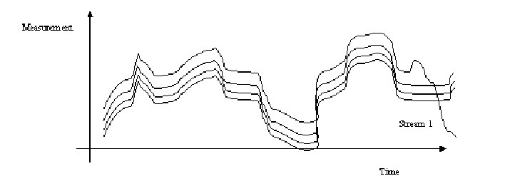
Figure 1. A single stream deviates from the others.
A separate control chart for each stream might be used in some cases, but it is not sensitive to the type of assignable cause shown in Figure 1. Measurements from Stream 1 are not unusual by themselves, but they are very unusual in relation to the other process streams. The power of control charts for a MSP is to detect this type of assignable cause.
Group Control Chart Disadvantages
A classical SPC method for a MSP is the group control chart. The chart simultaneously monitors the data to detect (1) an assignable cause that shifts the mean level of all of the streams over time (called an overall assignable cause) and (2) an assignable cause that changes the mean of one or more streams relative to the remainder (called a relative assignable cause). The group control chart uses a decision rule based on runs to check for a relative assignable cause that is not affected by (that is, it is not sensitive to nor degraded by) the presence of an overall assignable cause. If a particular stream generates the highest (or lowest) reading for r consecutive samples, then the stream is signaled to be off-target. The value selected for r is a trade-off between the number of false alarms produced by the chart and the time to detect an assignable cause. Consequently, the group control chart facilitates a parallel attack on both types of assignable causes that can expedite process improvements in a MSP.
However, Mortell and Runger (1995) described major disadvantages of the group control chart. For example, an out-of-control decision is based on consecutive high (or low) readings from a single stream. Consequently, if more than one stream shifts, and if the shifts are even approximately of the same magnitude, a single stream does not dominate and the detection of this assignable cause is poor. In the modern industrial environment, with automated data acquisition systems, a dozen to even hundreds of stream may be monitored simultaneously. Consequently, improvements to the group control chart were needed.
Recommended Control Charts for MSPs
Runger and Mortell (1995) recommended the simultaneous use of two control charts. One plots the average measurement from all the streams over time. The other chart plots some measure of uniformity of the streams. The range (or the standard deviation) of the measurements from each stream at a sample time is an obvious choice. The chart of means is sensitive to overall assignable causes, while the range (or standard deviation) chart is sensitive to relative assignable causes. These two can usefully replace a battery of charts generated as one for each stream, and improve the information.
The control limits for the range (or standard deviation) chart can be computed by the standard method. However, a strong warning is needed for the chart of averages. The control limits should be calculated as if each point was an individual (and the moving range method might be used). This is because the control limits should be based on variation over time (not the variation from stream to stream).
Advanced Methods
Runger and Fowler (1998) and Runger, Alt, and Montgomery (1996) considered the highly automated environment with dozens to hundreds of streams. If your factory is not there yet, you might be surprised how many are, and how soon you might be collect that type of data. They showed how some additional control charts could be used to supplement the two recommended and simple charts mentioned previously. Control charts based on the Analysis of Variance (ANOVA) and orthogonal contrasts can be used to partition the data into a hierarchy of effective control charts. And exponentially weighted moving averages (EWMAs) can be applied for even better process control. Just ask me about our current work.
Consider an example. Semiconductor manufacturing often processes a set of wafer together in a furnace. Each furnace run might contain anywhere from a few to dozens of wafers. In Figure 1, we show an example with four wafers in the run. After processing, oxide thickness is measured at nine sites on each wafer. Therefore, the data consist of 36 thickness measurements for each run. This is a classical multiple stream data set.
Traditionally, people control chart the run mean (the average of all 36 thickness measurements) and the run standard deviation. Although, these are worthwhile summaries, the standard deviation is an aggregate of all 36 readings and it is not sensitive process assignable causes that might be expected in such a process. For example, if these wafers are stacked top to bottom in the furnace, gas flow problems might change the top wafers relative to the bottom ones. In a process with the wafer positioned differently, one might expect differences between the center and edge sites on the wafers—again based on some knowledge of typical problems.
A set of control charts can be developed to be much more sensitive to anticipated problems, yet maintain the ability to signal unforeseen problems. A simple, but effective approach is to calculate a set of contrasts from the measurements in each run and control chart each one. A contrast is a linear combination (a weighted average, but negative weights are allowed) of the 36 measurements such that the weights sum to zero. That is, the positive weights cancel the negative weights. For example, the simple, but very effective control chart for the top versus bottom problem is a chart of the average of the nine sites from the top wafer minus the average of the nine sites from the bottom wafer.
Figures 2 and 3 illustrate control charts from a real, but prototype dataset of nine runs. This data is from
Czitrom, V. and Reece, J. E., Virgin Versus Recycled Wafers for Furnace Qualification: Is the Expense Justified?, Statistical Case Studies for Industrial Process Improvement, V. Czitrom and P. D. Spagon editors, Ch. 8, 87-104 (1997).
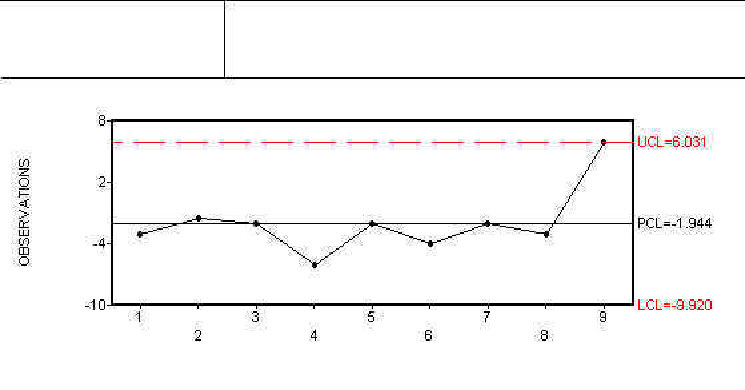
This dataset is too small to define control limits but it is adequate to demonstrate the method. Figure 2 illustrates an S chart for the runs and it appears fine. If we stopped there, we would be misled. We want to look more closely at within run uniformity with contrasts. Individuals charts were constructed for three contrasts. Each one can be thought of a separate measure of within run uniformity. We compared the center sites of the wafers to the edge sites with one chart and the left-to-right sites with another chart. Both of these charts were fine and are not shown. Figure 3 compares the top-to-bottom wafers and although the last point is not quite over the control limit, there is cause for concern (even with this limited data). The moral of the example is that the chart of the top-to-bottom contrast detects a problem that the aggregate of all of the data into an S chart fails to identify. As the size of our dataset continue to increase, this type of partitioning is more and more important. For more information of these types of charts contact George Runger at runger@dataengineering.com.
Figure 1
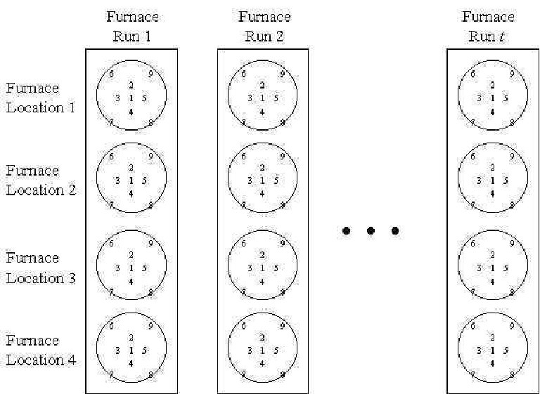
Figure 2
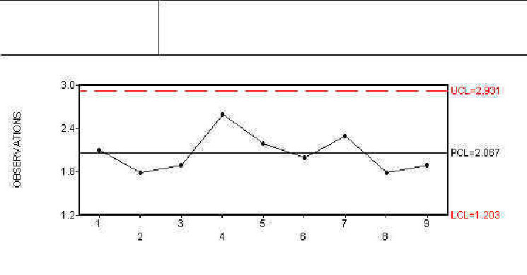
Figure 3
Mortell, R. and G.C. Runger (1995). "Process Control for Multiple Stream Processes", J. of Quality Technology 27(1), pp. 1-12.
Runger, G.C. and Fowler, J.W. (1998). "Run-to-Run Control Charts with Contrasts", Quality and Reliability Engineering International 14, pp. 261-272.
Runger, G.C., F.B. Alt, and D.C. Montgomery (1996). "Controlling Multiple Stream Processes With Principal Components", International Journal of Production Research, 34(11), pp. 2991-2999.
Learn more about the SPC principles and tools for process improvement in Statistical Process Control Demystified (2011, McGraw-Hill) by Paul Keller, in his online SPC Concepts short course (only $39), or his online SPC certification course ($350) or online Green Belt certification course ($499).


