Tools
Concepts
Interpretation & Calculations
Histograms, Process Capability
Applications
Key Success Factors for the Implementation of SPC
How to Study Process Capability
SPC to Improve Quality, Reduce Cost
Use Of SPC To Detect Process Manipulation
Struggling with Independence
by Paul Keller, CQE, CQA
An important but frequently overlooked assumption of statistical process control charts is that observations are independent. Unfortunately, the real world operates in ignorance of many statistical assumptions, which can lead to problems in analysis. Fortunately, these problems may be easily overcome, so long as they are recognized.
The Problem with Autocorrelation in Statistics
Independence of observations implies that the current data value provides no indication of the next data value. For independent processes in a state of statistical control, the best predictor of the next observation is the average. For dependent (or autocorrelated) processes, the best predictor of the next observation is based upon some function of the current observation (or a prior observation). For example, the outdoor temperature at 12:33 PM is likely to be highly correlated with the temperature at 12:32 PM, explaining in part why the television meteorologist can accurately predict that it is in fact hot outside, and will remain hot for most of the day.
Why is the independence assumption so important? Consider how X-bar charts are constructed. Each subgroup is used to estimate the "short term" average and variation of the process. The average short term variation (R-bar) is then used to estimate the control limits on both the X-bar and Range charts. If the process is "in control", or stable, then the average short term variation provides a good indication of long term variation. Therefore, in forming subgroups, a convenient rule to remember is that the short term (or within subgroup) variation must be comparable to the long term (or between subgroup) variation. In practical terms, the potential causes of within subgroup variation (i.e. the 5M & E: machines, materials, methods, manpower, measurement, and environment) should be comparable to those causes that exist between subgroups.
Similarly, the Individual-X / Moving Range chart is also prone to these errors. Here, since the subgroup size is one, the variation between consecutive subgroups is used to calculate the short term variation.
A process that violates the independence requirement would frequently cause the short term variation to be a poor indicator of long term variation. Consider the wait time for a bank teller station. It is likely that the wait time for each person would be influenced by (i.e. dependent on) the wait time of the person immediately in front of them. If we form subgroups of the wait time for several consecutive customers, the variation within the subgroup would most likely be much lower than the variation between subgroups.
When product is manufactured in distinct batches, and these batches are well mixed (homogeneous), the variation from sample to sample in a given batch is likely to be small compared to the variation between batches. Consider, for example, the brewing of a 5000 barrel batch of beer. Samples of this beer taken at various locations in the vessel will show subtle differences of any parameter, such as pH, within the vessel. These differences may be due to many factors such as measurement error, temperature gradients, and mixing inefficiencies. Now consider the parameters influencing pH variation between batches. The raw ingredients, grain and water, have properties of their own which affect pH. These batch-to- batch variables will more strongly influence pH than within batch factors: the between subgroup variation is much greater than the within subgroup variation.
A subgroup created from a sample of each head of a six-head machining operation (or six doctors performing the same procedure) would show correlation between every sixth observation. Differences between the heads cause the subgroup range to be large, resulting in excessively wide X-bar control limits.
These examples point out how control limits could be either too large or too small, resulting in failure to look for special causes when they really do exist, or searching for special causes that do not exist. The important point to note here is that these errors are not caused by the methodology itself but rather by ignoring a key requirement of the methodology: independence.
Detecting Autocorrelation
The scatter diagram in the following figure shows the correlation, or in this case the autocorrelation, between each observation and the one observed immediately (one period or lag) following it. Each period is one minute, or in other words one sample was taken every 60 seconds.
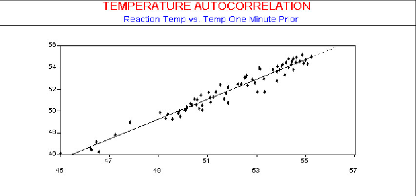
The scatter diagram in the next three figures shows the autocorrelation using observations with 2 minutes, 5 minutes, and 10 minutes between samples, respectively. As seen by the plots, the influence of an observed temperature on the temperature one minute later is stronger than on temperature readings made 10 minutes later.
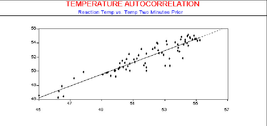
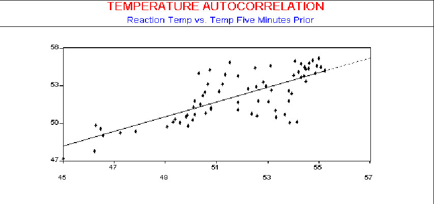
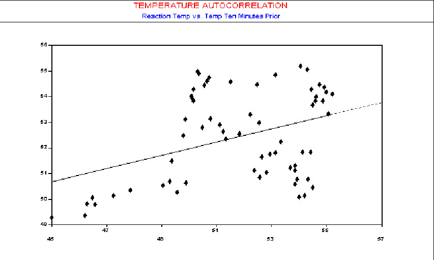
While Scatter Diagrams offer a familiar approach to the problem, they are a bit cumbersome to use for this purpose since you must have separate Scatter Diagrams for each lag period. A more convenient tool for this test is the Autocorrelation Function (ACF). It will directly indicate departures from the assumption of independence.
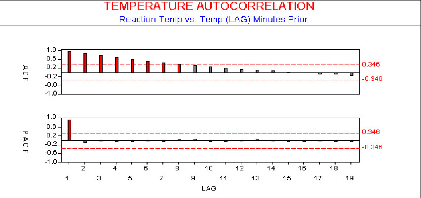
The ACF plots directly the autocorrelation at each lag, as shown in the next figure.
For example, if observations 46.2, 46.6, 46.5, 47.2 were recorded from a process, their overall average is calculated as 46.625, so the autocorrelation at lag one (r1) and lag two (r2) is calculated as follows:
r1= (46.2-46.625)*(46.6-46.625) + (46.6-46.625)*(46.5-46.625) + (46.5-46.625)*(47.2-46.625) / (46.2-46.625)2+ (46.6-46.625)2+ (46.5-46.625)2+ (47.2-46.625)2
r2= (46.2-46.625)*(46.5-46.625) + (46.6-46.625)(47.2-46.625) / (46.2-46.625)2+ (46.6-46.625)2+ (46.5-46.625)2+ (47.2-46.625)2
As you can see, this calculation is similar to those shown in statistical texts for the correlation between two factors, and much easier to do in SPC software. The ACF will lie between plus and minus one, with values closer to these limits signifying stronger correlation. In the figure, we have shown 95% confidence limits. We evaluate the ACF from lag one to lag n/4 (where n is the number of data points), since ACFs greater than that have been shown statistically unreliable (see Box, Stephen E. P. and Gwilym M. Jenkins, Time Series Analysis: Forecasting & Control. San Francisco, Holden- Day, 1970).
Dealing with Autocorrelation in Statistics
Such problems with autocorrelation can be accommodated in a number of ways. The simplest technique is to change the way we take samples, so that the effects of process autocorrelation are negligible. To do this, we consider the reason for the autocorrelation. If the autocorrelation is purely time-based, we can set the time between samples large enough to make the effects of autocorrelation negligible. (This idea is discussed in detail in SPC Demystified) In the example above, by increasing the sampling period to greater than 10 minutes, autocorrelation becomes insignificant. We can then apply standard X-bar or Individual-X charts.
A disadvantage of this approach is that it may force the time between samples to be so large that process shifts are not detected in a reasonable (economical) time frame. Alternatively, we could model the process based on its past behavior, including the effects of autocorrelation, and use this process model as a predictor of the process. Changes in the process (relative to this model) can then be detected as special causes. EWMA chart with moving center line has been designed for these autocorrelated processes.
When autocorrelation in statistics is due to homogeneous batches, we may consider taking subgroups of size one using an Individual-X chart. In this case, each plotted point represents a single sample from each batch, with only one sample per batch. Now the subgroup to sub- group variation is calculated using the Moving Range statistic, which is the absolute value of the difference between consecutive samples. An enhancement to this method is to take multiple samples per batch, then average these samples and plot the average as a single data point on an Individual-X chart. This is sometimes referred to as a Batch Means Chart. Each plotted point will better reflect the characteristics of the batch, since an average is used. The calculation of the batch average is easily done using robust options such as found in SPC software.
Learn more about the SPC principles and tools for process improvement in Statistical Process Control Demystified (2011, McGraw-Hill) by Paul Keller, in his online SPC Concepts short course (only $39), or his online SPC certification course ($350) or online Green Belt certification course ($499).


